PETAL & STEM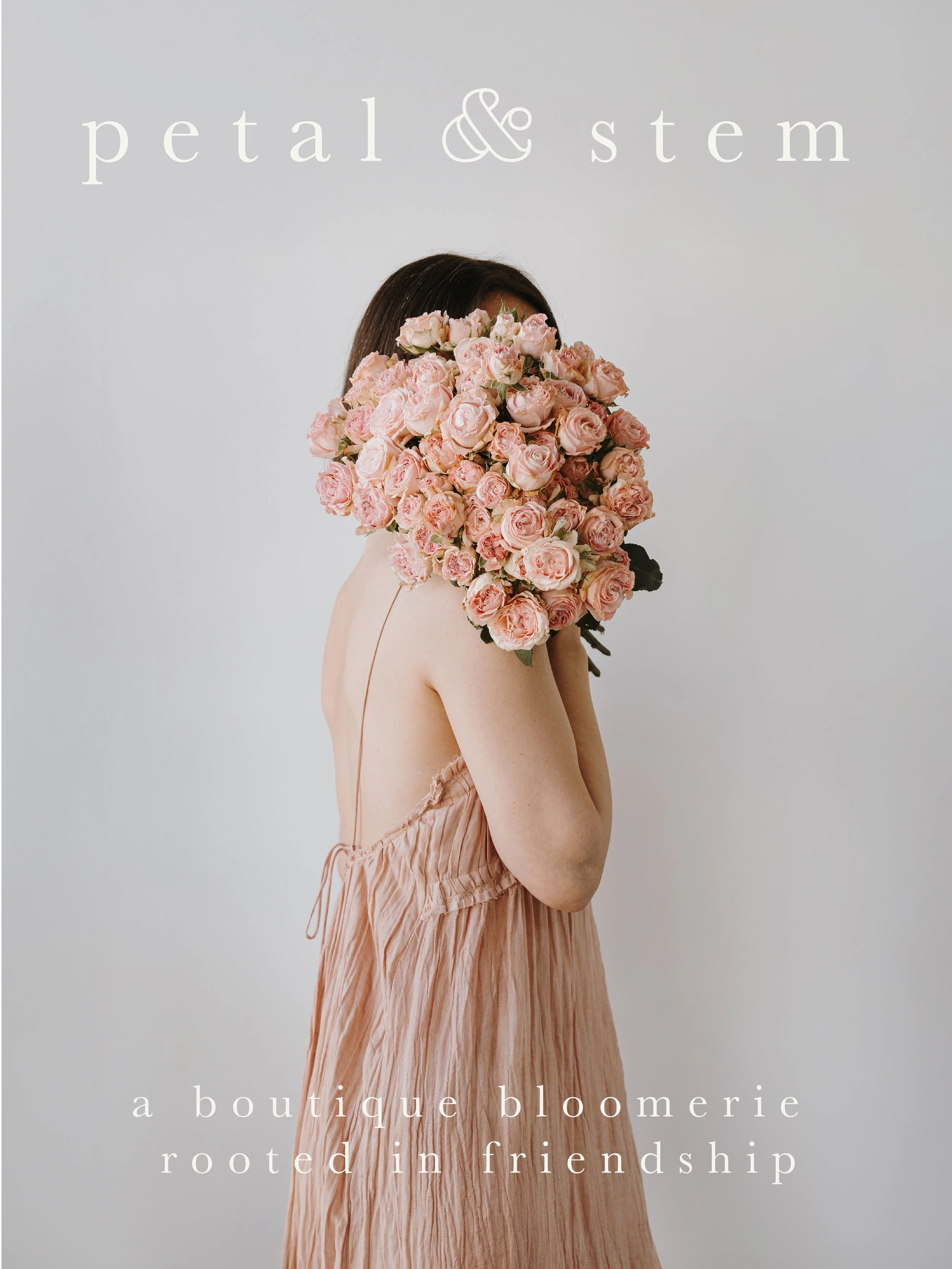
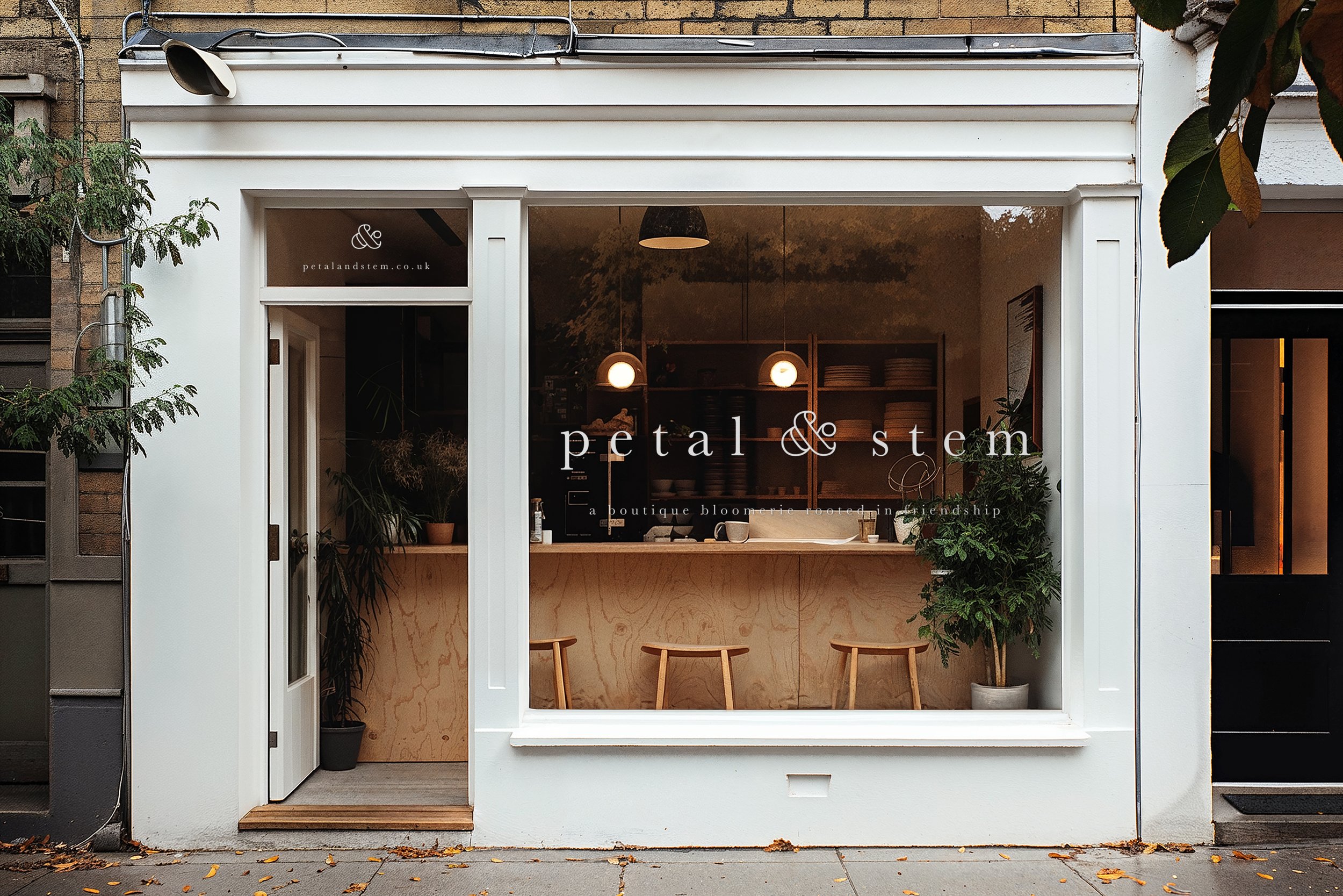
Born from a Creative Boom brief, Petal & Stem is more than a florist—it’s a "bloomerie." Founded by two best friends, this concept explores the intersection of seasonal British flora and the soulful, restorative spirit of an apothecary.
The Vision
The challenge was to honor nature’s strict calendar. At Petal & Stem, there are no imports and no fillers—just the wild, honest beauty of what is growing right now. I wanted the visual identity to feel like a warm embrace: rooted in tradition, yet pulsing with modern life.
Design Details
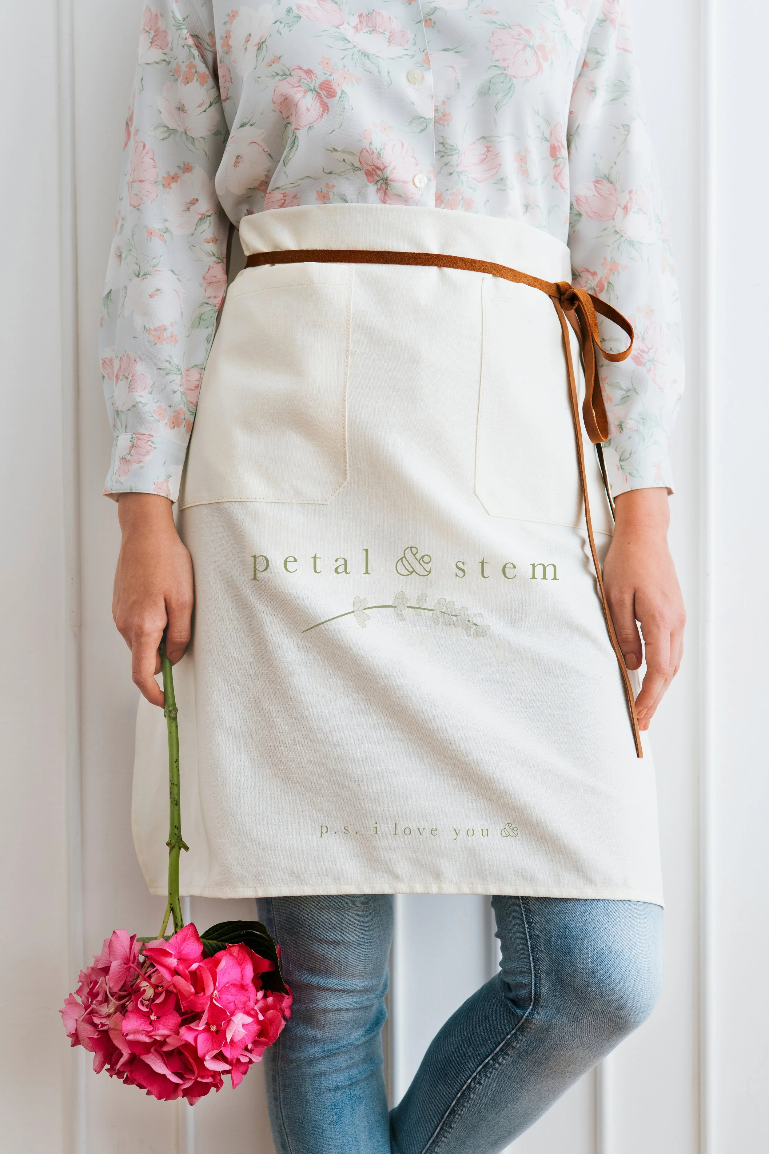
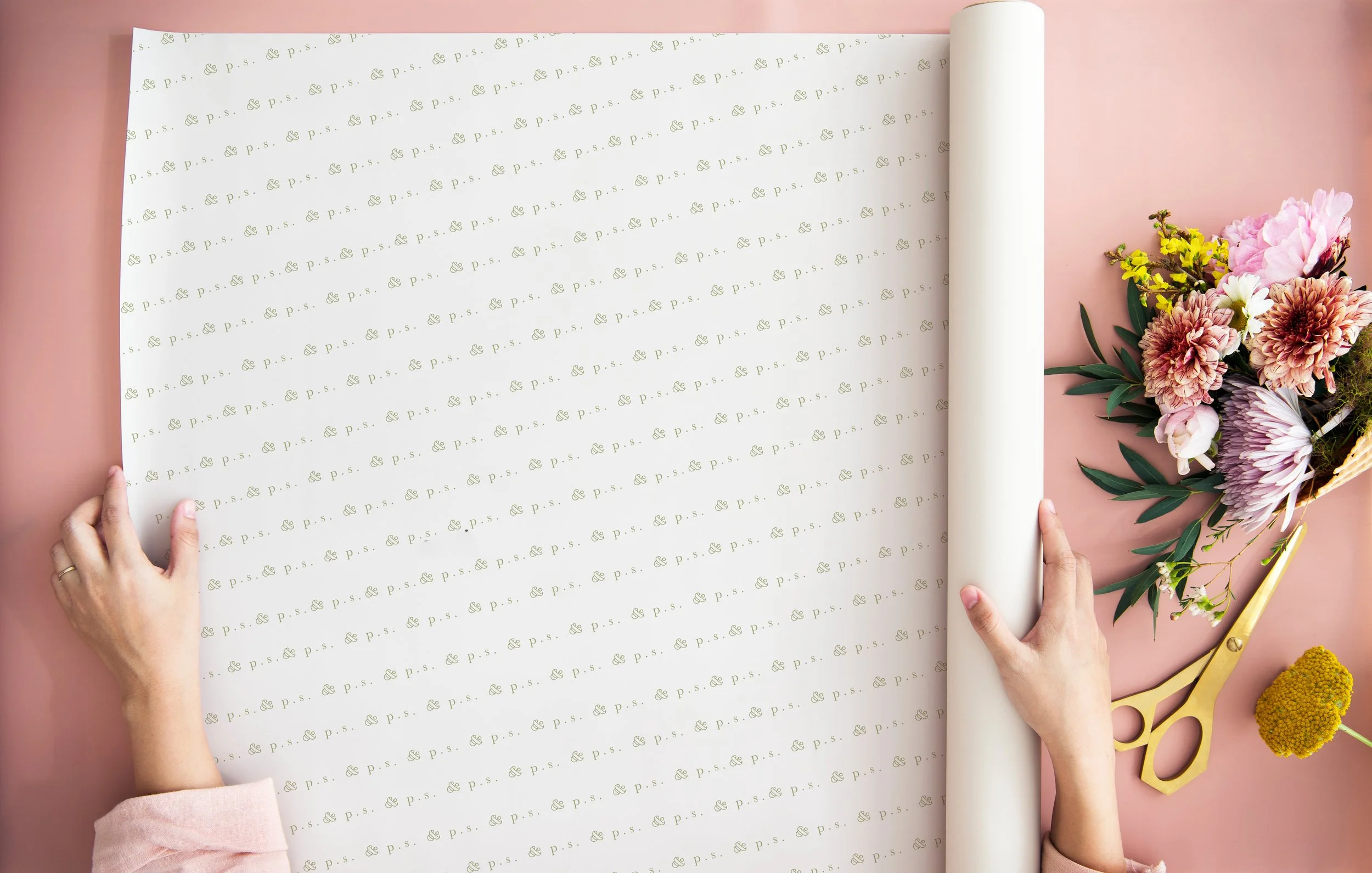
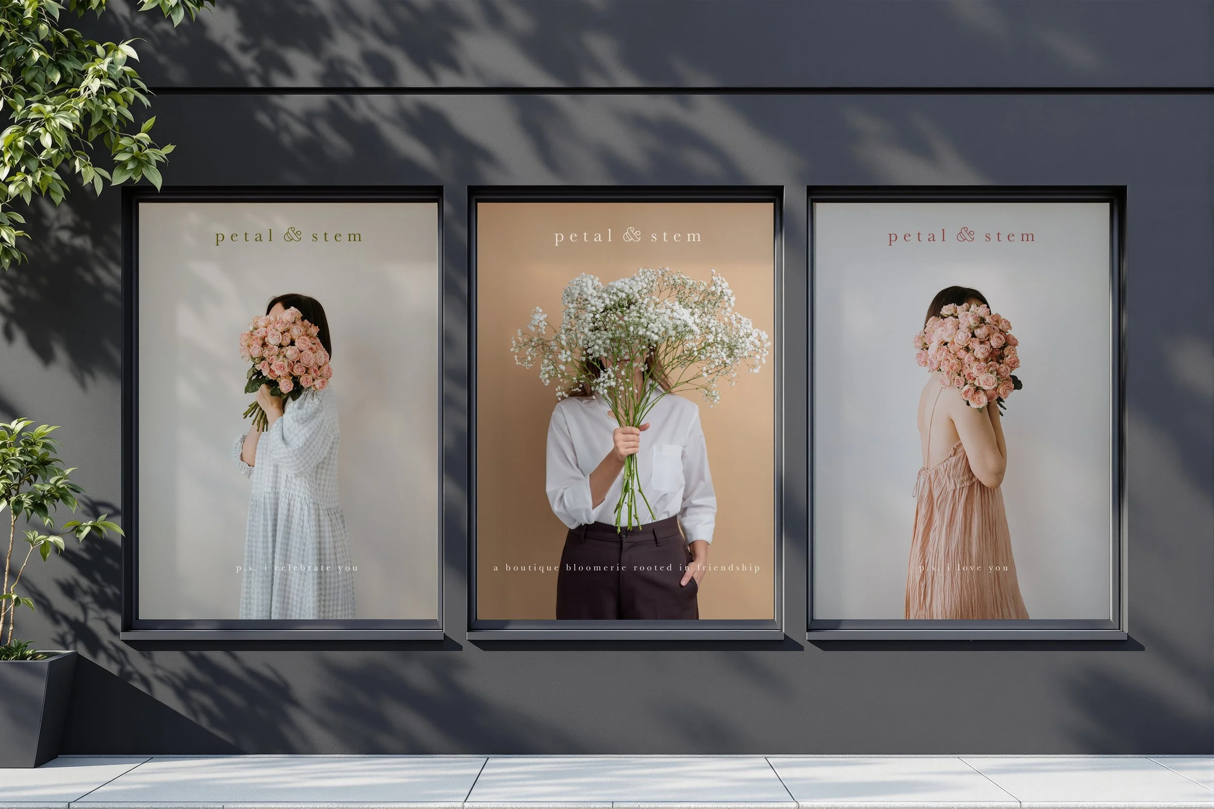
Typography: I paired a romantic, timeless serif with a bold, outlined ampersand. This creates a visual balance between the delicate "Petal" and the sturdy "Stem," mirroring the partnership behind the brand.
Palette: Rather than a static brand color, I developed a living palette. It shifts and grows with the seasons, ensuring every touchpoint feels as fresh and surprising as a new bloom.
The "Bloomerie" Identity: By positioning the shop as a bloomerie, the design leans into "spiritual medicine," treating every foraged arrangement as a prescription for joy.
The "P.S. &" Campaign
At the heart of the brand is the P.S. & campaign—a celebration of the "why" behind the gift. Whether it’s "P.S. I love you," or "P.S. I’m thinking of you," the brand acts as a messenger for friendship.
To bring this mission of goodwill to life, I established a brand ritual: The Gift of a Single Stem. With every bouquet sold, the customer receives a single extra flower—a small token of friendship to keep for themselves or pass along to a stranger.