vertex construction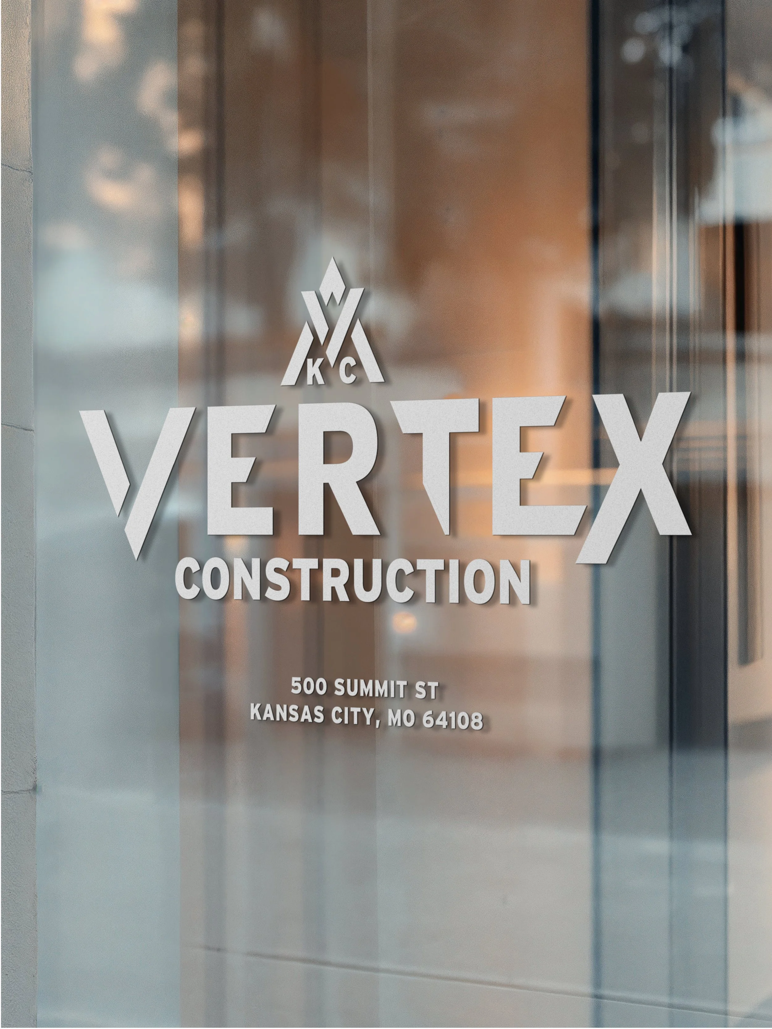
Vertex Construction entered the Kansas City market with a clear mission: to redefine the general contractor experience through radical collaboration and client advocacy. As a startup in a legacy-heavy industry, they needed a visual identity that felt established yet disruptive—professional enough to trust, but modern enough to notice.
The Strategy and Evolution
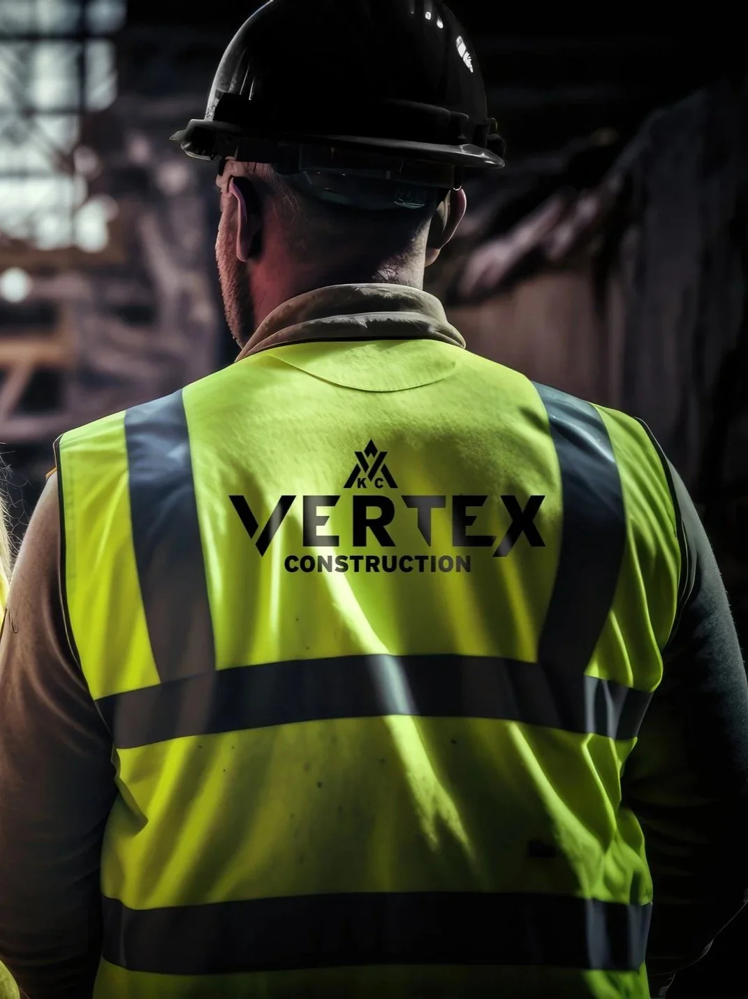
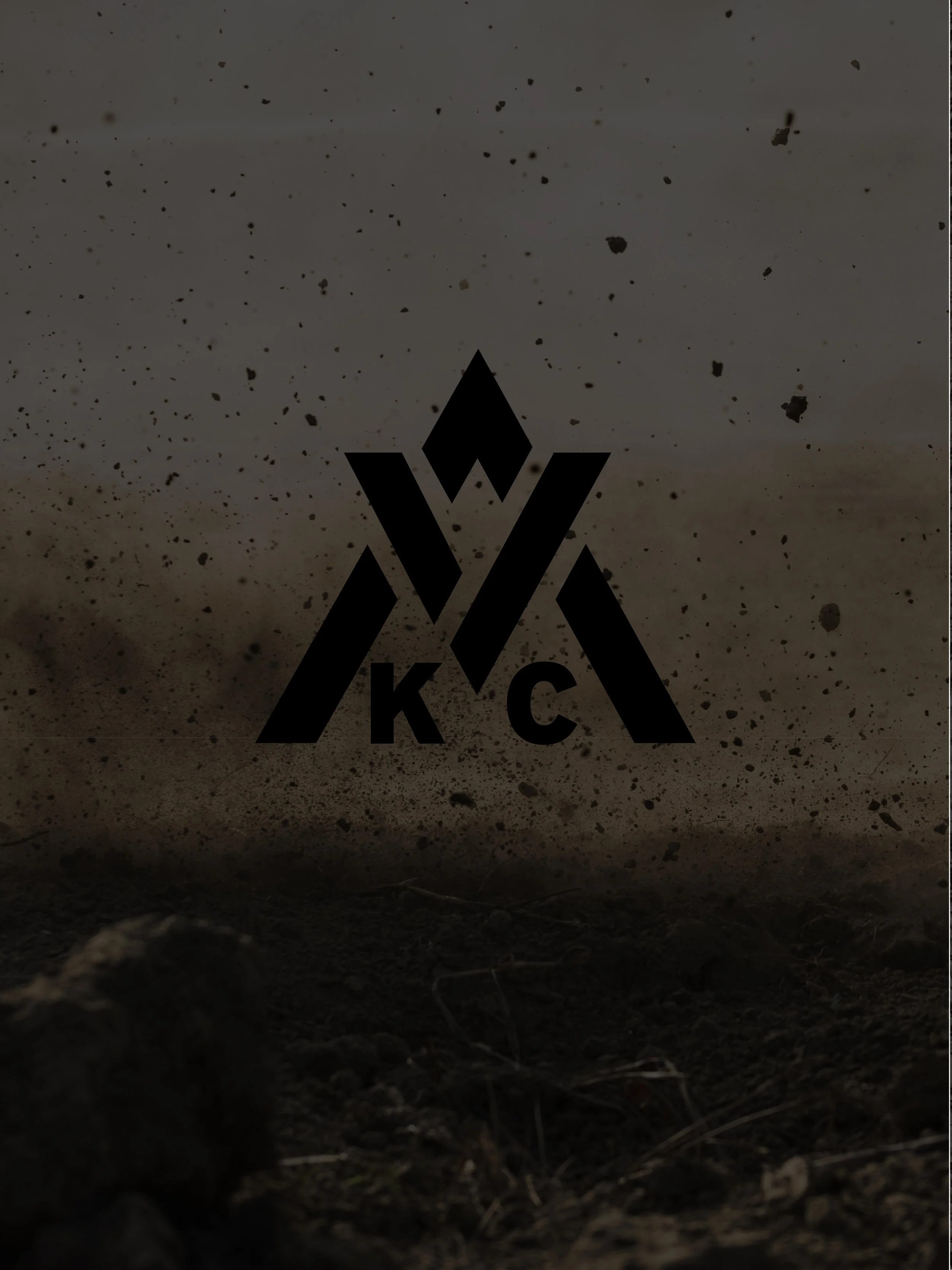
To give Vertex a competitive head start, I developed a brand architecture rooted in four core pillars: Authenticity, Modernity, Athleticism, and Surprise. The centerpiece of the identity began with a concept sketched by the owner. I refined this vision into a geometric mark centered on an "apex”. This focal point is designed for ultimate flexibility: it can be boldly highlighted, subtly alluded to, or hidden entirely depending on the application.
Visual Identity & Color Theory
The visual language avoids the "noise" of traditional firms by leaning into high-energy contrast and sophisticated grounding.
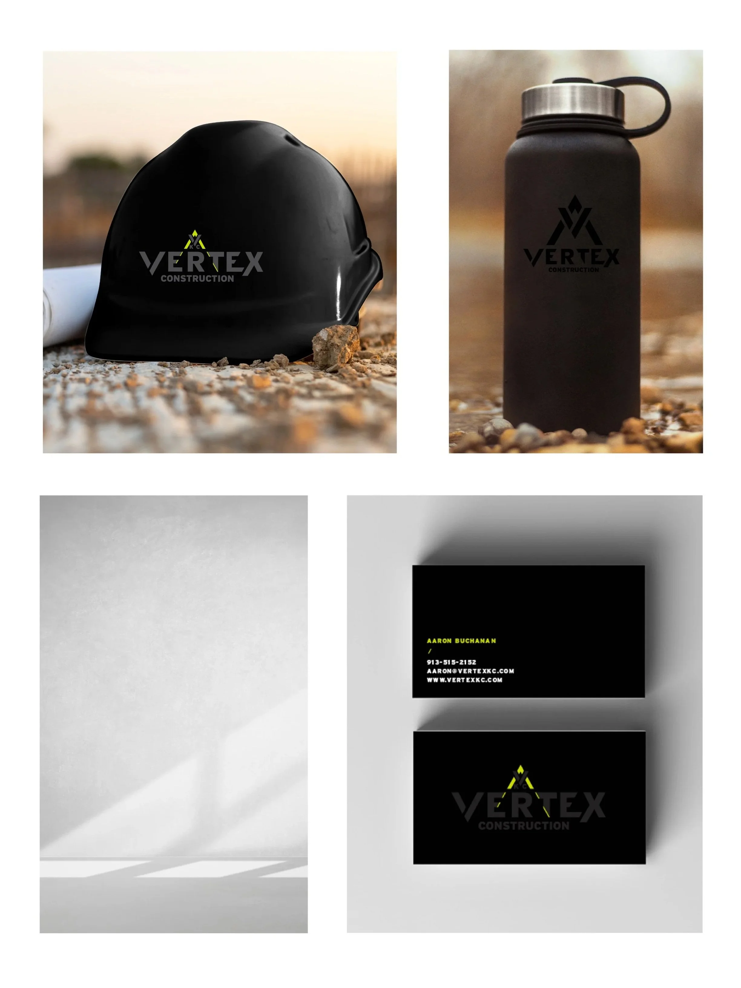
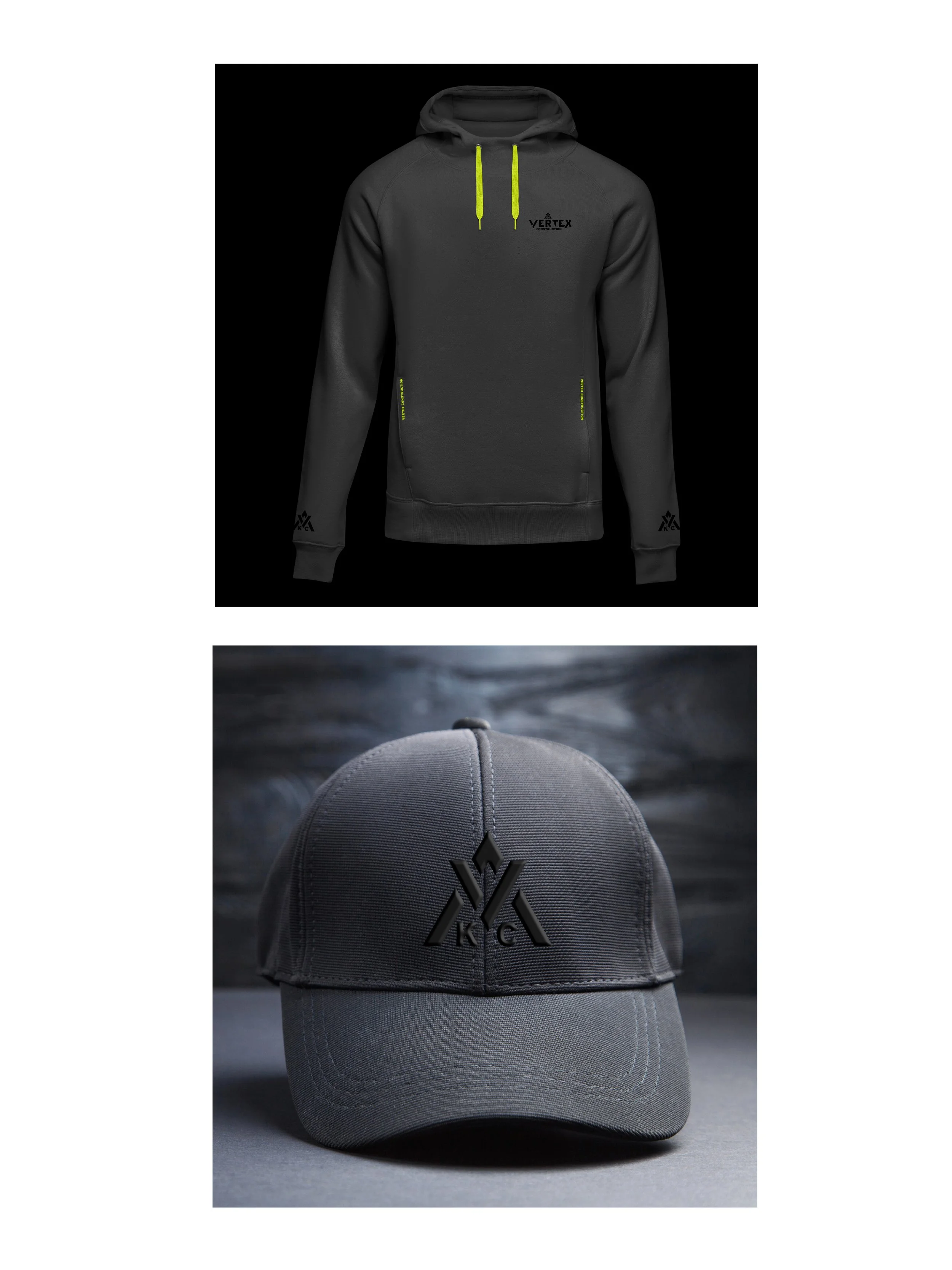
The primary brand color—a high-saturation lime-chartreuse—serves as an energetic pulse for the brand. It’s a deliberate pivot from industry norms, leaning heavily into green for growth while retaining a warm, bright undertone.
To ensure the brand remains professional and approachable, I anchored the neon hits with a foundation of deep graphite and warm concrete gray. This palette provides pops of energy without sacrificing the weight and stability required of a general contractor.
The Outcome
The result is a brand that moves as fast as the Kansas City skyline. Vertex doesn't just look like a construction company; they look like a partner engineered for the future of the build.